 I don’t generally write blogs until the job is over, but for this huge project, I’ll make an exception. Larger than painting giant murals in the public space, I have a partner who is empowering me to curate my professional vision within their long term strategy and updates.
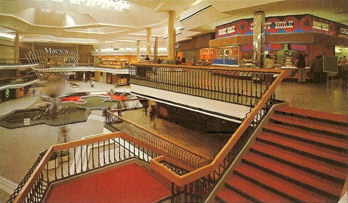
 The first step to this is announcing the remodel of a local landmark in a beautiful way. Eastridge Mall opened its doors in the 1970’s and continues to develop a modern feel. Back then, it was one of the largest, most spectacular retail centers on the West Coast. I first encountered Eastridge Mall as a partner for a Community project using Public Art to develop stronger, healthier Community bonds. Now, undergoing remodel, Eastridge will be curating a whole new vision for the Evergreen area mall that inspires me to no end. Personally, I believe strongly in Art with Function, and I so appreciate the opportunity to explore that function in this meaningful medium with this partnership.
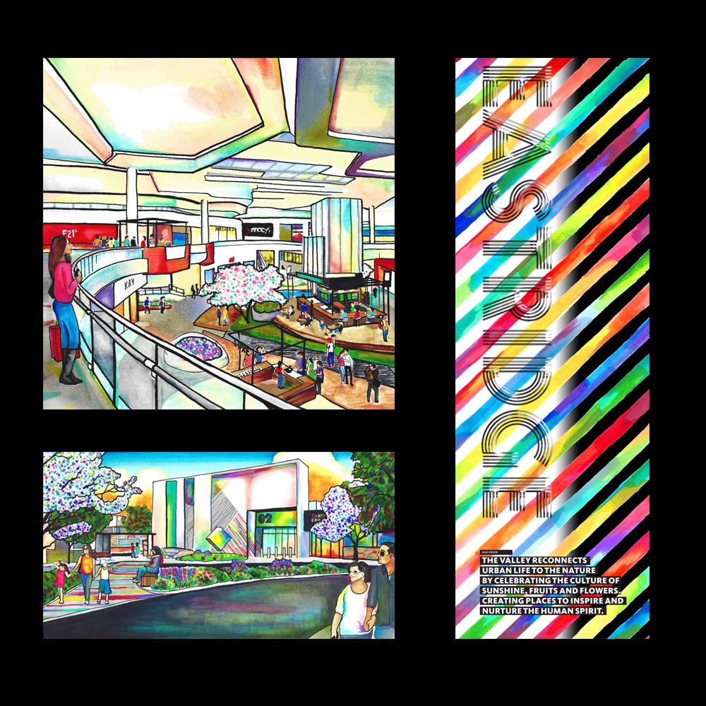
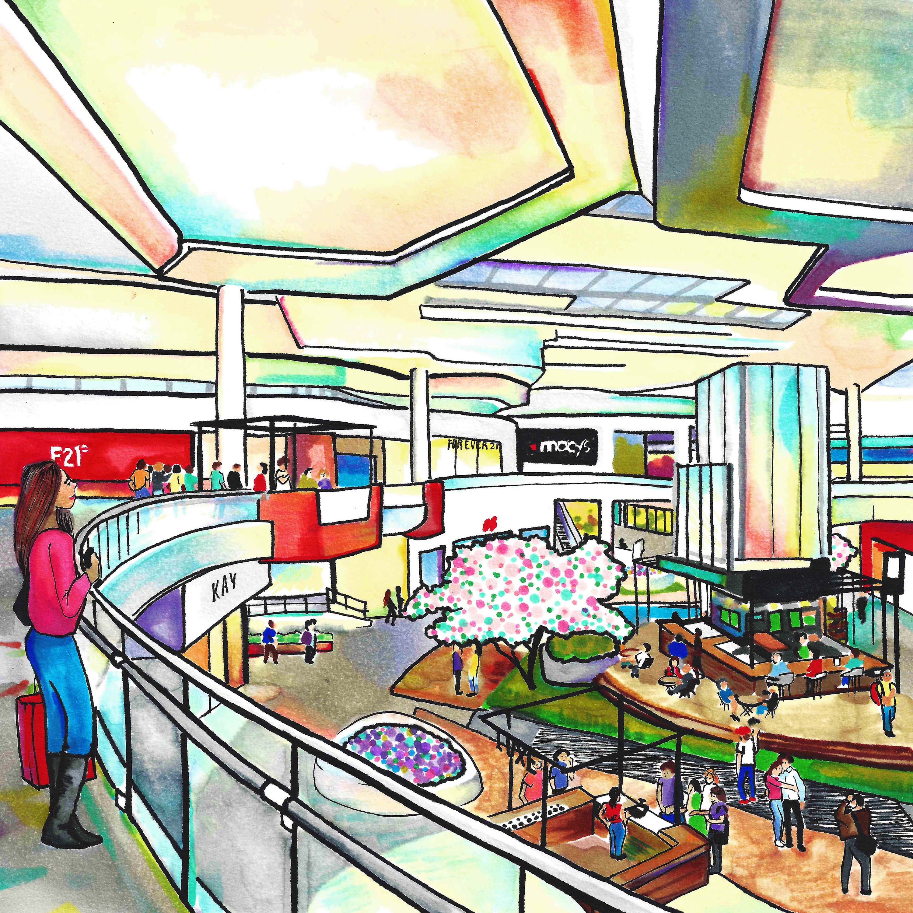
 Updates to San Jose’s Eastridge Mall will make it more accessible to the Community, creating open spaces with indoor foliage, wood paneling and clean lines. Eastridge Mall, @eastridgecenter, would like to become a hub for the Community, an event center instead of just brick and mortar stores. Eastridge has also hired artists to paint all over the exterior, which I’m a part of. An artist’s touch can warm up architect’s imagined special plans with color and make it palatable for residents and shoppers. Long term, I see the absolute value in this.
 Artwork for architects has huge function in my opinion because of my professional background. It gave me real pause in my previous career of real estate and construction. I couldn’t tell why the owners had chosen a certain architect, scheme or project based on the aesthetic of the elevations and drawings. It was fascinating to me in the blueprint room. I wish I could see what the owners and investors saw in these gray and beige watercolors to invest so much into uninspired seeming spaces. I’m certain square footage and parking were higher concerns than the façade and building itself. The boring elevation drawings prove that. To me, this is a re-envisioning of an old staple of Old World construction. This color allows casual observers to follow the lines and cast their own experience and emotions onto the structure. Otherwise dull and clean lines become exciting through the artistic process.

